My Process, With Examples & Video
Here’s an overview of how I develop a painting. To see examples, click here, and for a video interview in which I talk about my work, click here. You can also visit my FAQ page for answers to frequently asked questions about pastels and how I use them.
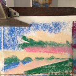
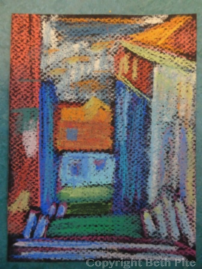
- I start by reviewing lots of my photos to determine what I feel like painting that day. Then I usually do quick “thumbnails,” 4 x 6 inch pastel sketches where I block in the largest shapes to determine if the painting will work.
- Next, I gather several photos of the chosen scene, playing with them and the thumbnails to decide what to include. This helps me find an interesting composition, and to resist the urge to try to fit everything into one painting.
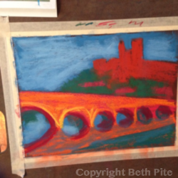
- The real painting starts with the largest light and dark shapes. I block them in, check whether things will fit as I’d hoped, tweak the composition, and decide on a focal point to draw the viewer’s eye.
- If it seems ok, I start to fill in the painting, adding shading and depth, fine-tuning the spacing and moving things if needed. At this stage, I resist the urge to get detailed – no leaves on plants, faces on people, or words on signs.
- I continue to play with multiple colors, layering them over each other to add interest to otherwise solid areas. When adding details, I don’t try to get realistic because this isn’t a photograph – it’s a painting meant to show energy and feeling.
- I usually walk away at this point to let the painting sit for days or weeks as I ponder what’s needed for finishing touches. I glance at it to see what grabs my eye. I sit and stare at it, making notes about things to fix. I try new colors, while being careful not to overwork and dull the painting. Then I sign it, and it’s done!
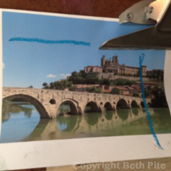
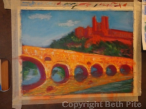
These images show a painting in progress. The Canal du Midi in southern France passes over a viaduct in the town of Beziers, beneath an ancient castle. I marked up the photo to test how best to crop it for a better composition. I used my thumbnail sketch to determine that it could become a good painting, based on the balance of large shapes and interesting angles. I started the painting by blocking in the big shapes, deciding to de-emphasize the castle and the sky by showing less of them. I emphasized the viaduct bridge by making it brighter, to show the impact it had on me. Finally, I ignored the photos and painted expressively, using color to convey the feeling of awe I had when standing downriver of that bridge.
 |
 |
 |
 |
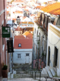
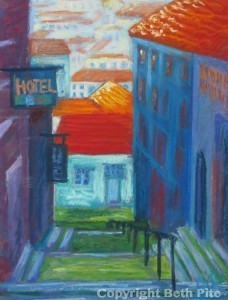
This scene of Lisbon, Portugal, was particularly complicated because the city is full of hills – one of which I was standing on, looking out over hundreds of tiled rooftops. I wanted to convey the wonder created by the height, light and color of Lisbon – and the sense that we could topple downhill at any moment. That’s why I minimized detail and contrast in the foreground buildings, to keep attention on the height and distance. Here’s the photo, my thumbnail sketch, and the finished painting.
 |
 |
 |
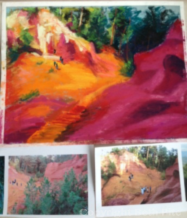
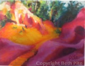
Here are photos, the work in progress, and my finished painting of Roussillon. It’s a mountain town in southern France where they used to manufacture pastels from minerals in the cliffs. One photo gave me the basic shapes, and another gave me details. Still other photos reminded me about the vibrant colors in the cliffs, clarified the shape of the hiking path, and showed me where the sun was. In the finished painting, I rounded shapes and eliminated foreground details in order to emphasize the sharp light hitting the colorful cliffs.
 |
 |
In 2016, the producer/host of Community Culture Showcase invited me to appear on Southeastern Connecticut Television to talk about my paintings, my process and my inspiration. See the hour-long interview here.
[embedyt] http://www.youtube.com/watch?v=-prRHcGxQQY[/embedyt]